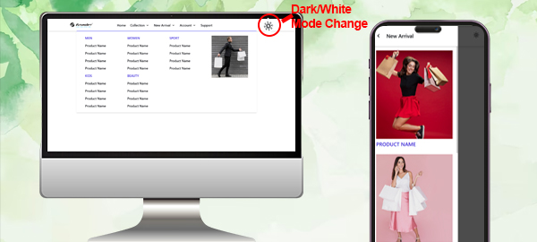
It's a responsive header with CSS. Responsive Header Change the design of the header depending on the screen size. On Mobile Menu opens with Slide the content
Click Here..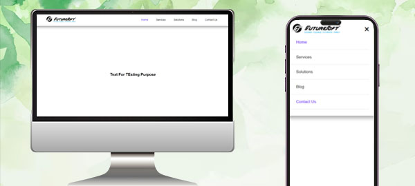
A responsive multi-level menu that shows its submenus in their own context, allowing for a space-saving presentation and usage.
Click Here..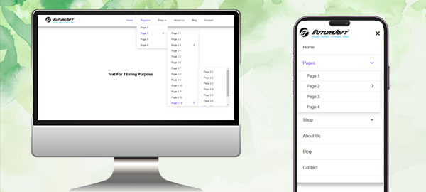
Its a Header with responsive navbar menu. It's a crucial element of a website that adjusts its layout and appearance based on the screen size and device type used by the user. On Mobile Menu navbar opens without Sliding below content.
Click Here..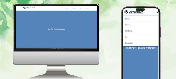
This is an animated and interactive content 3d rounded carousel for website. Drag to rotate the carousel with 360 degree rotation. Can control position by dragging the image and can be used for spinning a 3D image.
Click Here..